Movie Poster Review: Back to the Future
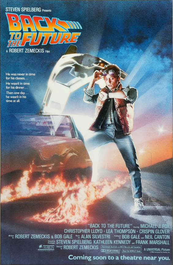
The poster for “Back to the Future” is a classic example of graphic design done right, using a variety of motifs to draw viewers in and communicate the main ideas of the movie. Here is a thorough breakdown of its main features: The poster makes use of a strong color scheme, with accents of red and yellow mixed in with shades of blue and white. In addition to conjuring feelings of excitement and adventure, these hues also reflect the movie’s themes of time travel and cutting-edge technology. The contrasting red and yellow accents enhance visual appeal and highlight significant details, while the blue backdrop represents the expanse of space and time.The Marty McFly and Doc Brown characters take center stage in this dynamic and captivating poster arrangement. With Doc looking confident and mysterious, and Marty standing proudly in the foreground next to the famous DeLorean time machine, he looks excited. The arrangement beautifully encapsulates the spirit of the movie’s quest and accentuates the main characters’ functions within the story. Their placement highlights their importance in the plot and creates a visual hierarchy. The poster’s top section prominently displays the recognizable “Back to the Future” logo, which is written in large, capital characters using a futuristic font style. This instantly identifiable emblem acts as a potent branding tool, connecting the renowned movie series with the poster. Placing the logo in the right spot guarantees maximum visibility and strengthens the movie’s identity. The title and credits are written in a clean, contemporary font that adds to the poster’s overall visual appeal. Sans-serif fonts give a modern touch to the design while guaranteeing readability. Furthermore, the thoughtful arrangement of textual components guarantees cohesion and clarity, making it simple for readers to understand the content. Marty and Doc are positioned against a background of whirling clouds and electrical arcs in a composition that is visually arresting and well-balanced. The DeLorean time machine, encircled by electricity and sparks, takes center stage, signifying the thrill and peril of time travel. In addition to adding complexity to the poster’s overall design, the composition successfully communicates the adventurous idea of the movie. By including well-known symbols like the clock tower, the flux capacitor, and the DeLorean time machine, the poster’s visual appeal is enhanced and the movie’s time-traveling premise is further supported. These components act as visual cues that stimulate and bring back memories for franchise aficionados. The “Back to the Future” movie poster is a stunning work of graphic art that skillfully conveys the essence of the picture and draws viewers in with its eye-catching images and visual narrative. The poster creates a lasting impact on viewers by deftly utilizing color, layout, character placement, logo, and other design aspects to portray the excitement and adventure of the time-traveling story.
On this site we may occasionally recommend product(s) that we use and love. If you take action (i.e. make a purchase) after clicking one of the affiliate links, Venice Review may earn some coffee money, which we promise to drink while continuing to support our visitors. You do not pay a higher price. Some services are even free.