
Book Cover Review: Harry Potter & The Sorcerer’s Stone
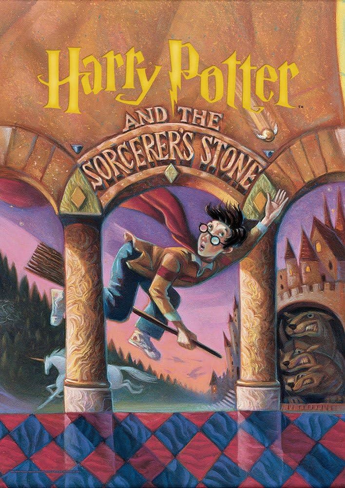
The cover of “Harry Potter and the Sorcerer’s Stone” is a work of graphic design art that perfectly captures the spirit of J.K. Rowling’s fantastical universe while upholding fundamental concepts of branding and visual communication. The cover has a rich, dramatic color scheme with tones of black, gold, and burgundy. In addition to reflecting the mystical and enigmatic elements of the narrative, these hues evoke a feeling of charm and enchantment that transports readers to the magical world of Hogwarts School of Witchcraft and Wizardry. The author’s name, the title, and the artwork are all carefully balanced in the cover’s layout. The centerpiece features the well-known picture of Hogwarts Castle, encircled by minute details and symbols that allude to the adventures that lie ahead in the pages. In harmony and coherence, the arrangement produces a focal point that draws the spectator in. Although there aren’t many figures on the cover, the placement of the castle and other magical items quietly indicates how important characters like Ron Weasley, Hermione Granger, and Harry Potter are to the story. Their omission from the cover heightens the sense of mystery and intrigue and entices readers to read the rest of the story. The title’s typography is recognizable, with a unique font that has come to be associated with the Harry Potter franchise. A feeling of whimsy and magic is evoked by the graceful flourishes and bold typography, which are instantly recognizable to fans all around the world. In order to enhance visibility and impact, the typeface is also placed deliberately, making the title stand out among the elaborate artwork. Important ideas and elements from the narrative are represented by the carefully picked imagery on the cover. With its soaring spires and magical atmosphere, Hogwarts Castle is a representation of exploration and adventure. The visual narrative is enhanced by ancillary features like the Sorting Hat, the Hogwarts Express, and magical animals, which provide readers with a peek of the wonderful world that lies ahead. The “Harry Potter and the Sorcerer’s Stone” book cover is proof of the ability of graphic design to pique readers’ interest and transport them to a fantastical world. Every element of the cover, from its eye-catching colors and design to its deft use of text and photography, is painstakingly created to captivate viewers and create a visual identity that is synonymous with the series.
On this site we may occasionally recommend product(s) that we use and love. If you take action (i.e. make a purchase) after clicking one of the affiliate links, Venice Review may earn some coffee money, which we promise to drink while continuing to support our visitors. You do not pay a higher price. Some services are even free.