Movie Poster Review: Inglourious Basterds
The “Inglourious Basterds” movie poster is a remarkable piece of graphic art that brilliantly conveys the spirit of director Quentin Tarantino’s distinct approach to cinema. Here is a thorough breakdown of its main components:
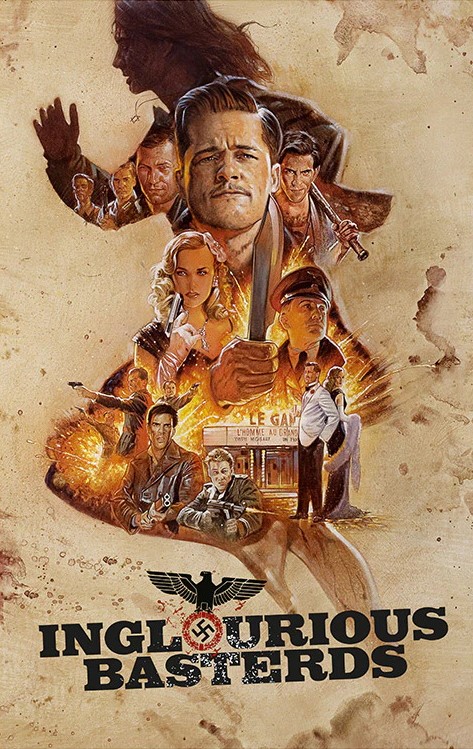
Colors: The poster’s primary color scheme is red and black, which is a common denotation of violence and intensity in Tarantino flicks. The dark background adds depth and mystery, and the striking usage of red draws the eye and communicates a sense of danger. The grim and darkly humorous storyline of the movie is established by these hues. The poster’s layout is visually arresting and dynamic, with a strong focus on Lt. Aldo Raine, played by Brad Pitt, and the troops known as the “Basterds.” The film’s concept of revolt and retribution is reflected in the action poses in which the protagonists are shown brandishing weapons and projecting confidence. Tarantino’s unique style and historical drama are masterfully blended in the layout.
Character Positioning: To convey a sense of movement and hierarchy, the characters on the poster have been thoughtfully placed. The other characters are arranged around Lt. Aldo Raine, who is prominently positioned in the middle to symbolize his leadership role. Each character has a unique attitude and emotion that corresponds to their personality and part in the narrative. The poster gains depth and visual appeal from this layout.
Logo: Using a bold, stylized font reminiscent of old-fashioned war propaganda posters, the film’s title is prominently placed at the top of the poster. The logo’s design contributes a nostalgic touch to the entire style while reiterating the film’s theme of resistance throughout the war.
Typeface: The poster’s overall visual appeal is enhanced by the sleek and contemporary typeface used for the movie’s credits and tagline. Sans-serif fonts give a modern touch to the design while guaranteeing readability. Important information is presented to readers in a clear and concise manner because to the thoughtful positioning of text elements.
Composition: The actors are positioned against a background of explosions and gunfire in a dynamic and well-balanced composition for the poster. This arrangement emphasizes the protagonists’ resolve and friendship while simultaneously successfully communicating the action-packed, tense essence of the movie. The way the composition is put together grabs the audience’s interest and builds suspense and excitement for the movie.
Iconography: The use of recognizable images like helmets, firearms, and military insignia highlights the wartime context of the movie and gives the poster more visual appeal. These components add to the poster’s overall impact and memorability by acting as visual cues that appeal to lovers of the war genre.
The “Inglourious Basterds” movie poster is a superb illustration of graphic design that successfully conveys the mood and ideas of the picture. The poster honors Tarantino’s distinct style of filmmaking while effectively conveying the film’s blend of historical drama, action, and dark comedy through its use of colors, layout, character positioning, and other graphic features.
On this site we may occasionally recommend product(s) that we use and love. If you take action (i.e. make a purchase) after clicking one of the affiliate links, Venice Review may earn some coffee money, which we promise to drink while continuing to support our visitors. You do not pay a higher price. Some services are even free.