Movie Poster Review: Star Wars: A New Hope
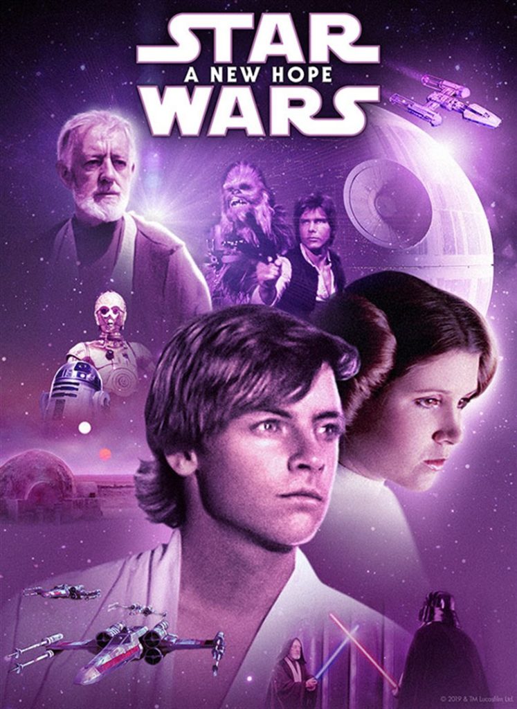
The “Star Wars: A New Hope” movie poster is a classic example of graphic design that successfully conveys the spirit of the picture while grabbing viewers’ attention with its striking visuals. Here is a detailed examination of its several facets: The poster mostly uses a striking combination of black, white, and several tones of blue in a dramatic and contrasting color scheme. The film’s sci-fi concept is complemented by the use of blue colors, which create feelings of adventure and space. The poster’s arrangement is striking and dynamic, showcasing the heroic figures of Han Solo, Princess Leia, and Luke Skywalker in the center. These characters are arranged in a certain way to grab the audience’s interest and build suspense. Every character’s location on the poster has been thoughtfully planned to communicate their functions and connections within the story. With his lightsaber in hand, Luke Skywalker stands boldly in the forefront, representing bravery and optimism. Princess Leia, standing just behind Luke, radiates resolve and courage. Han Solo offers a gruff flair and sense of adventure with his blaster raised. The poster’s top section is dominated by the recognizable “Star Wars” logo, which is displayed in large, capital letters using a very futuristic font. This instantly identifiable emblem, which has grown to be associated with the franchise, is a potent branding tool that helps viewers understand the identity of the movie. The film’s title and credits are written in a sleek, futuristic font that goes well with the poster’s overall design. Sans-serif typefaces are used to modernize the design and improve readability. The Death Star, X-wing fighters, and the commanding presence of Darth Vader surround the main characters in a well-balanced arrangement on the poster. In addition to highlighting the main ideas and conflicts of the movie, this arrangement gives it depth and grandeur, drawing spectators into the epic space opera. The use of well-known symbols like blasters, lightsabers, and spacecraft strengthens the sci-fi theme of the movie and improves its aesthetic appeal. In addition to stimulating the curiosity of potential viewers, these components function as visual cues that appeal to enthusiasts of the genre. To sum up, the “Star Wars: A New Hope” movie poster is a superb illustration of graphic design that successfully conveys the ideas, characters, and aesthetic of the movie. With a clever use of color, composition, character placement, logo, and other graphic aspects, the poster grabs viewers’ attention and is still hailed as a classic work of cinematic art.
On this site we may occasionally recommend product(s) that we use and love. If you take action (i.e. make a purchase) after clicking one of the affiliate links, Venice Review may earn some coffee money, which we promise to drink while continuing to support our visitors. You do not pay a higher price. Some services are even free.


