
audiobooks | ebooks | general | publishing | reviews
The Women: A Novel Review
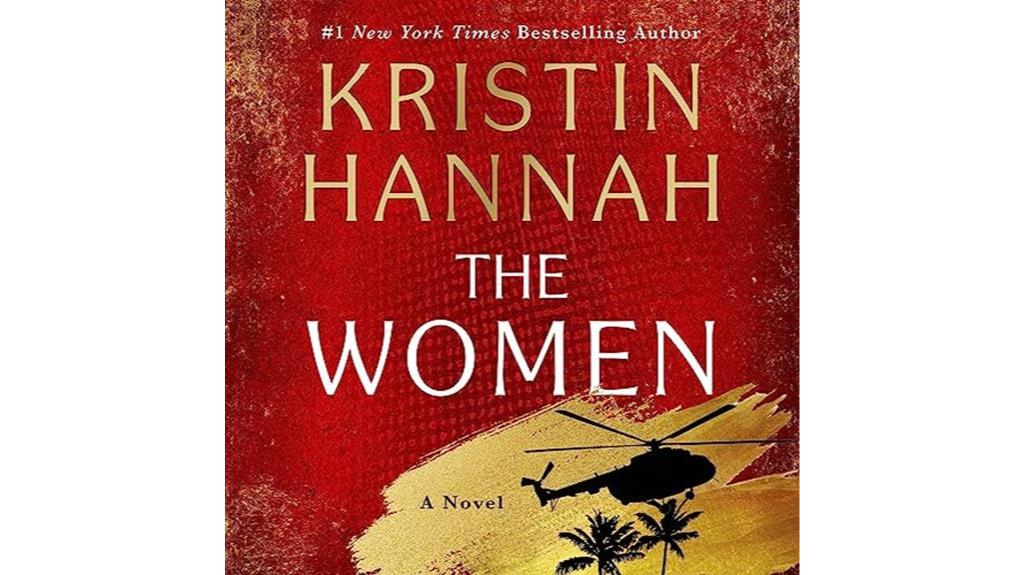
Kaleidoscope of emotions unravel as 'The Women: A Novel' by Kristin Hannah delves into the profound struggles of a nurse during the Vietnam War.
Kaleidoscope of emotions unravel as 'The Women: A Novel' by Kristin Hannah delves into the profound struggles of a nurse during the Vietnam War.
The book cover for “A Tale of Two Cities” is carefully examined, taking into account a number of important graphic design components. The color scheme is essential for expressing the story’s theme and emotion. The cover usually reflects the historical context of the work during the French Revolution by combining dark colors like deep blues,…
The “Star Wars: A New Hope” movie poster is a classic example of graphic design that successfully conveys the spirit of the picture while grabbing viewers’ attention with its striking visuals. Here is a detailed examination of its several facets: The poster mostly uses a striking combination of black, white, and several tones of blue…
Movie posters are visual representations that capture the spirit of a film and entice viewers with a glimpse into its universe; they are more than just advertising tools. A compelling movie poster needs to be created with a combination of artistic vision, accuracy, and practical tools. When it comes to graphic design, Figma has changed…
In today’s digital age, audiobooks have become increasingly popular as a convenient and enjoyable way to consume literature. With the rise of platforms like Audible and a growing demand for quality audio content, opportunities abound for individuals to turn their love for listening into a profitable venture. One such avenue is through reviewing audiobooks. In…
Book covers serve as more than just covers to shield the pages within; they are portals to other realms and invite readers to travel through literature. Achieving a captivating book cover requires a careful balancing act between imagination, accuracy, and well-thought-out design decisions. Figma is a collaborative platform that facilitates collaboration and helps designers unleash…
The “Inglourious Basterds” movie poster is a remarkable piece of graphic art that brilliantly conveys the spirit of director Quentin Tarantino’s distinct approach to cinema. Here is a thorough breakdown of its main components: Colors: The poster’s primary color scheme is red and black, which is a common denotation of violence and intensity in Tarantino…
The cover of “Harry Potter and the Sorcerer’s Stone” is a work of graphic design art that perfectly captures the spirit of J.K. Rowling’s fantastical universe while upholding fundamental concepts of branding and visual communication. The cover has a rich, dramatic color scheme with tones of black, gold, and burgundy. In addition to reflecting the…
The book cover for J.R.R. Tolkien’s epic fantasy series “The Lord of the Rings” is a famous depiction of the world, combining thematic significance and elaborate design features to portray the grandeur and mystique of Middle-earth. The book cover’s color palette was carefully chosen to complement the magical world that the narrative portrays. The palette…